The Notes Dashboard For Martin & Bosco’s Tumblr Post
Ever wondered how Martin and Bosco’s post traveled through the Tumblr community? This mini-report offers an early look at the notes activity behind it, including reblogs, likes, and replies, using data from Tumblr’s /notes API endpoint. The interactive dashboard lets you explore daily and hourly patterns, or track download progress as more notes are collected.
ⓣ Read the text version of the notes dashboard.
Access the Dashboard
Launch the Dashboard: Click to launch. It opens in your browser.
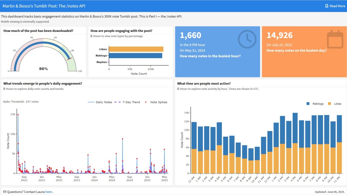
Best Viewed: On a laptop or desktop. Mobile viewing is minimally supported. On small screens, landscape orientation is suggested for improved plot display and easier use of interactive features.
Last Updated: June 6, 2025.
Dashboard Features
Here are a few of the dashboard’s features:
Download progress for the post’s notes (as a fun gauge!).
Interactive plots with hover text.
Notes grouped by type (likes, reblogs, replies).
Daily and hourly notes activity patterns.
How to Use the Dashboard
You are encouraged to explore the data!
Read the focus question for each section to guide your interpretation.
Look for plots labeled with “ⓘ Hover …” and mouse over the data to reveal tooltips with dates and note counts.
Change the view by clicking legend items on or off.
Created With
The dashboard was built in R using the plotly and flexdashboard libraries.
About the Data
- Post notes were collected using Tumblr’s rickety
/notesAPI endpoint, starting on May 21, 2025. The custom R script carefully abides by Tumblr’s API rate limits. - Data collection is ongoing.
Ethical Data Use
The ethical use of data is important to me! Notes from Martin and Bosco’s post are grouped by type, day, or hour — no blog names or individual actions are part of the dashboard’s underlying structure. All data is publicly available, and no access circumvention methods were used.
Making Sense of the Data
A few tips to help you interpret the plots. I tried to keep the mathematical explanations gentle!
The Daily Notes Line Plot
What is the purpose of the 7-day trend line?
The 7-day trend line (the dashed purple line) smooths out daily noise by averaging note counts over a centered 7-day window. This reduces the impact of random daily ups and downs, making it easier to spot broader patterns in activity.
Follow the purple dashed line to see the post’s overall engagement momentum. Rising sections of the dashed line show when the post was picking up engagement; falling sections show when attention slowed down.
What do the red dots in the plot mean?
The red dots mark days when the note count spiked or when daily activity was higher than usual. Adding the red dots, or spike threshold, to the line plot makes it easier to spot unusually active days at a glance. Turns out the post had a lot of busy days!
To set a simple, consistent threshold value for the red dots, I looked at the shape of the data collected so far — the histogram of daily notes is heavily right-skewed, with a much higher mean than median. Inspired by an approach to anomaly detection, I adapted a basic method using the median plus four times the median absolute deviation (MAD) to flag unusually busy days (Gesino, 2021). This 4× threshold is considered conservative and follows recommendations from the statistical methods literature (Leys et al., 2013; Miller, 1991).
Using data from June 6, 2025, the median was calculated in R as 61 notes and the MAD[1] was 46.5 notes. I set the conservative threshold using:
\[\text{Spike Threshold} = 61 + (4 \times 46.5) = 247\]
This results in days with 247 notes or more being marked with a red dot in the line plot. As more notes are collected, the spike threshold adjusts automatically to reflect changing activity patterns. But the calculation method stays the same to ensure fair comparisons over time.
To put the spike threshold into context:
As a Tumblr Ancient, 247 daily notes is a lot by 2025 standards! That’s more like 2010-era activity.
[1] For the data nerds: MAD was calculated with the scaling constant set to ( b = 1 ). The underlying distribution is not yet known, but early data suggests it is not normal (Leys et al., 2013; “Median Absolute Deviation in R,” 2023).
The Stacked Bar Graph
What time zone is the notes per hour graph displayed in?
Tumblr’s rickety API stores timestamps in UNIX time, which counts the number of seconds since January 1, 1970 (UTC). On the dashboard, all times are displayed in Coordinated Universal Time (UTC) for consistency. UTC is the global time standard: it doesn’t adjust for daylight saving time and serves as the baseline for all other time zones.
Keep this in mind when exploring hourly activity — the hours shown on the graph’s x-axis are based on Coordinated Universal Time (UTC), not your local time.
For example, 4:00 PM UTC is Noon in Eastern Standard Time (Toronto time).
Stay Tuned
The dashboard will be updated as more notes are downloaded. Will there be a new winner for the most notes in an hour? Think of it as enrichment for your enclosure.